Fun With Poisson Disk Sampling
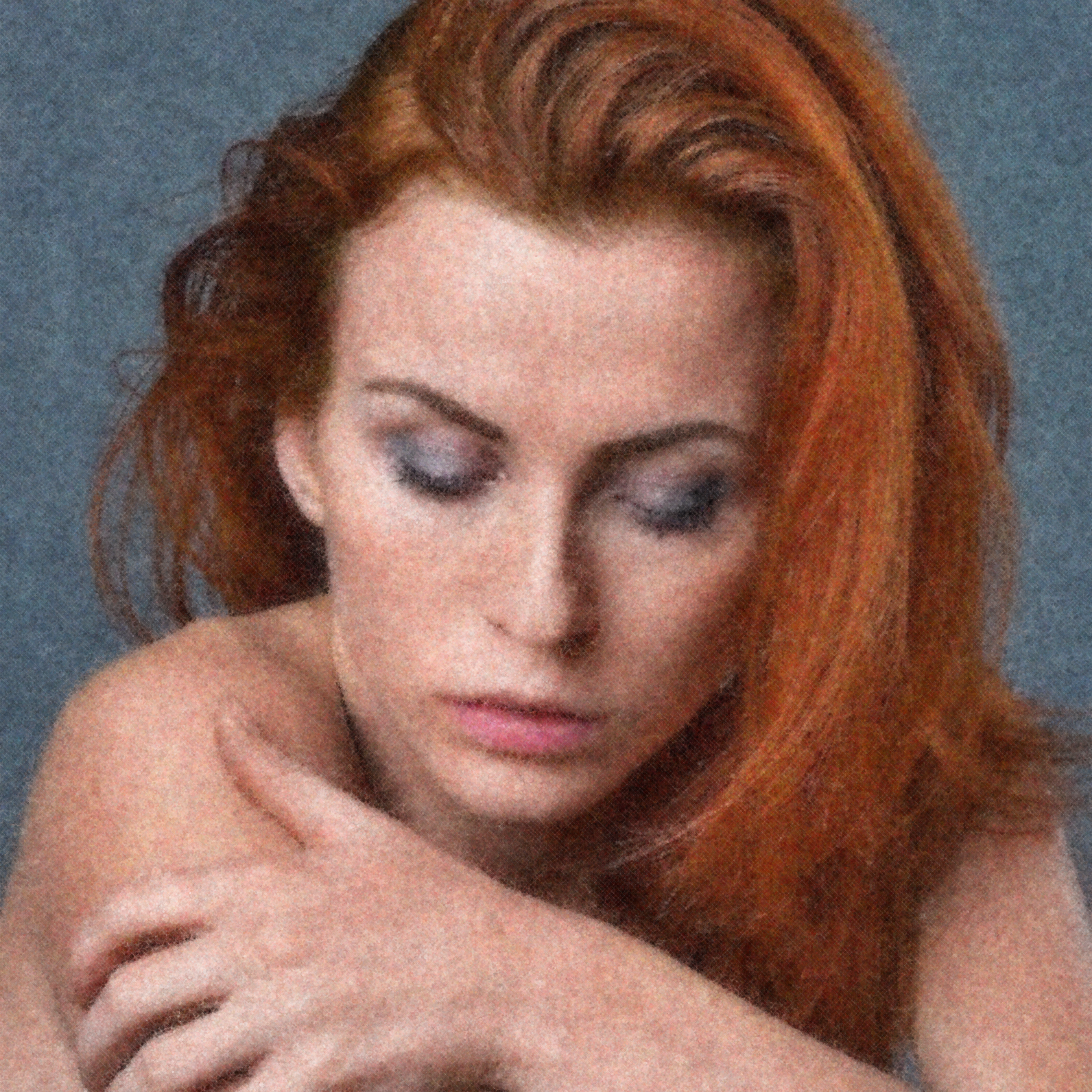
In my last post, I showed how to implement Bridson’s algorithm for Poisson disk sampling, and you might find yourself wondering where it might be useful. Well, wonder no more! In this post, I show some examples of how it can be used to make interesting versions of this image below.

Click the images below to view a high-resolution version. WARNING: some of the images are quite large (over 65MB).
Stippling
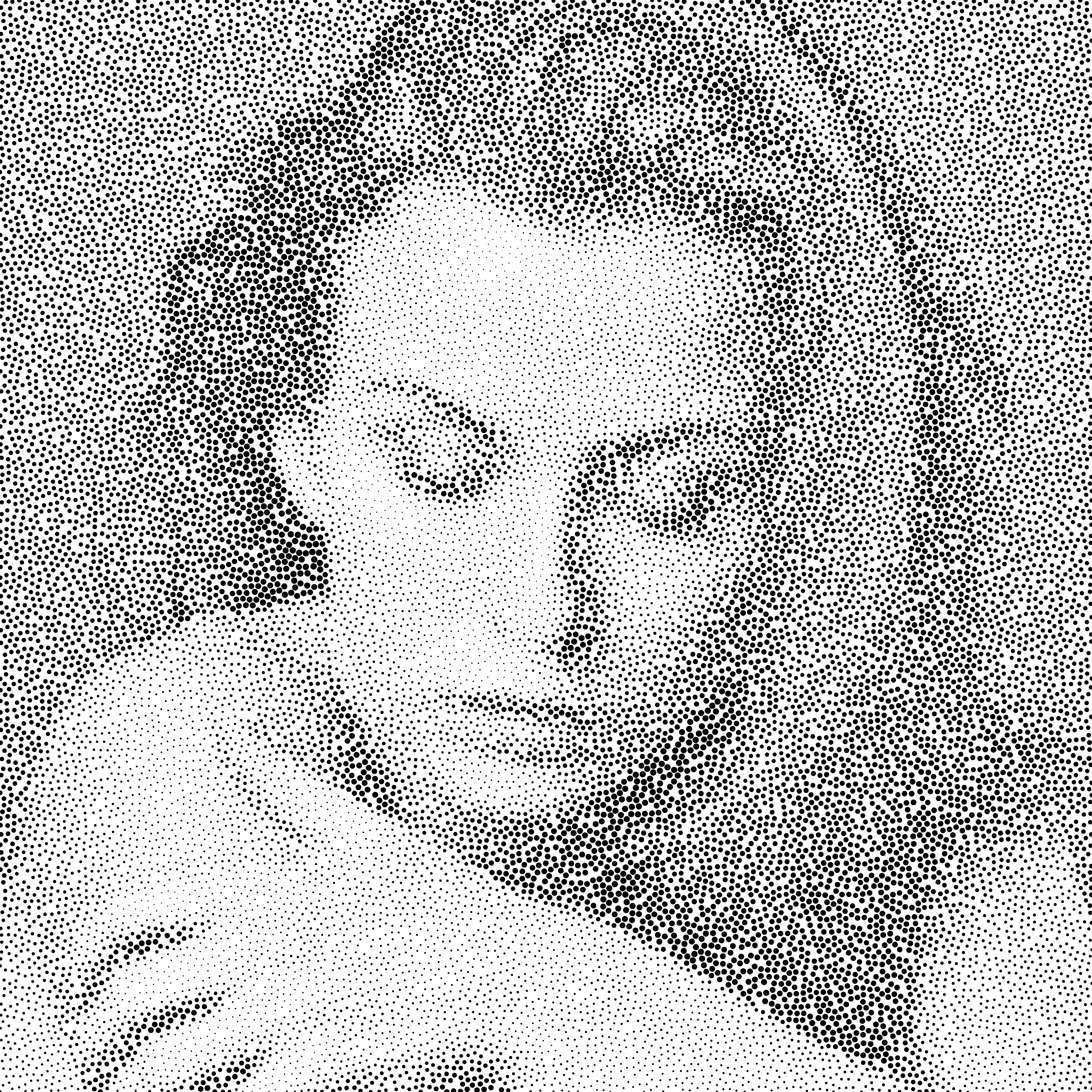
This is a very simple algorithm. Once all the points have been created, for each one, I simply mapped the size of the ellipse drawn to the grayscale value of the pixel in the image!
Oil On Canvas
Here, I used layers of points generated using Bridson’s algorithm. Starting with large radii and working backwards to a small one brings out the details in the image. Colors are assigned to the ellipses based on the average color of all pixels in the region. A final touch of a canvas-like grid makes it appear painterly.
Charcoal Sketches
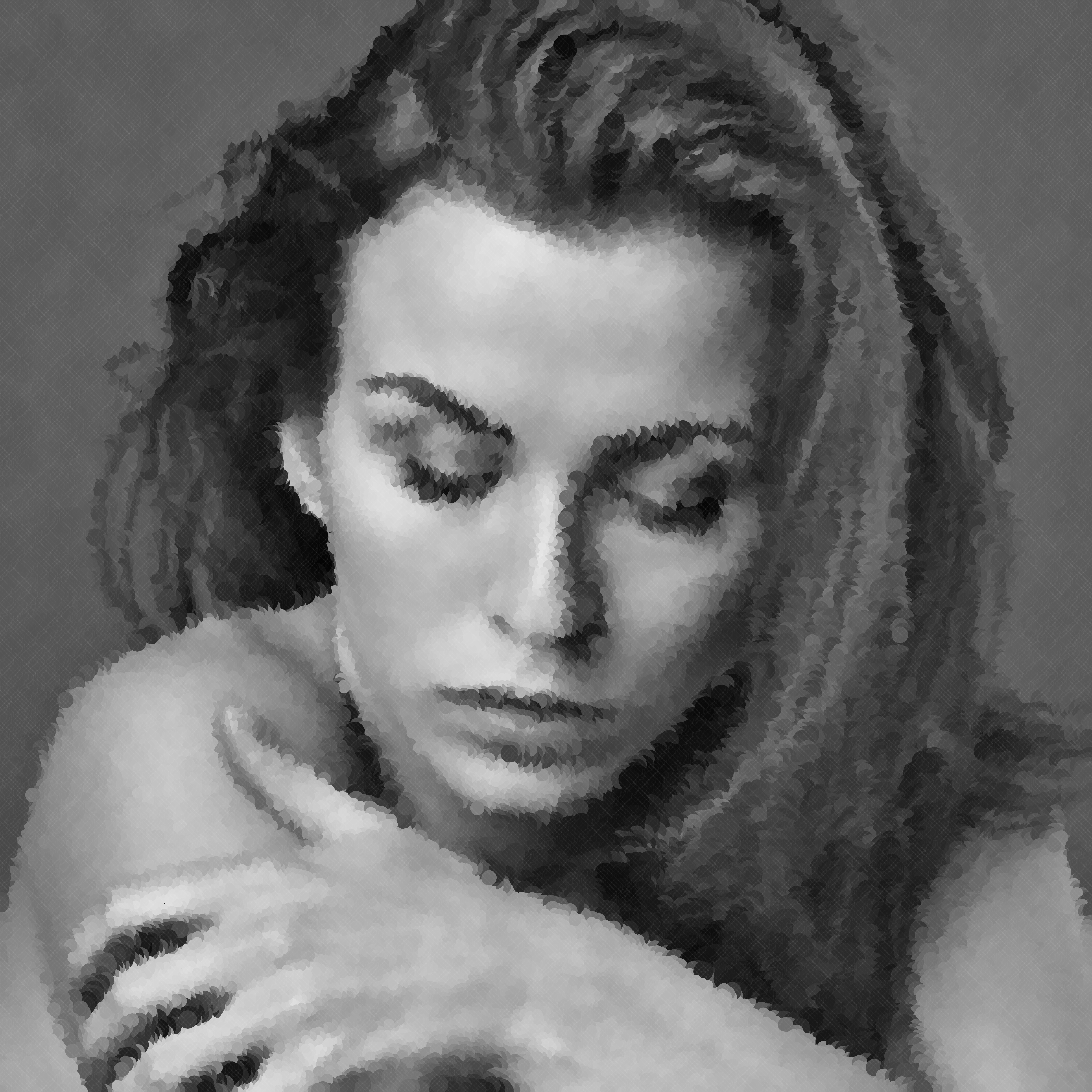
Here I create circles colored with the grayscale color in the image at the point being drawn, and give it a radius proportional to the darkness value. So a point over a black region gets a large radius while that over a white area gets a small radius. The effect is quite stunning!
Voronoi Mosaics
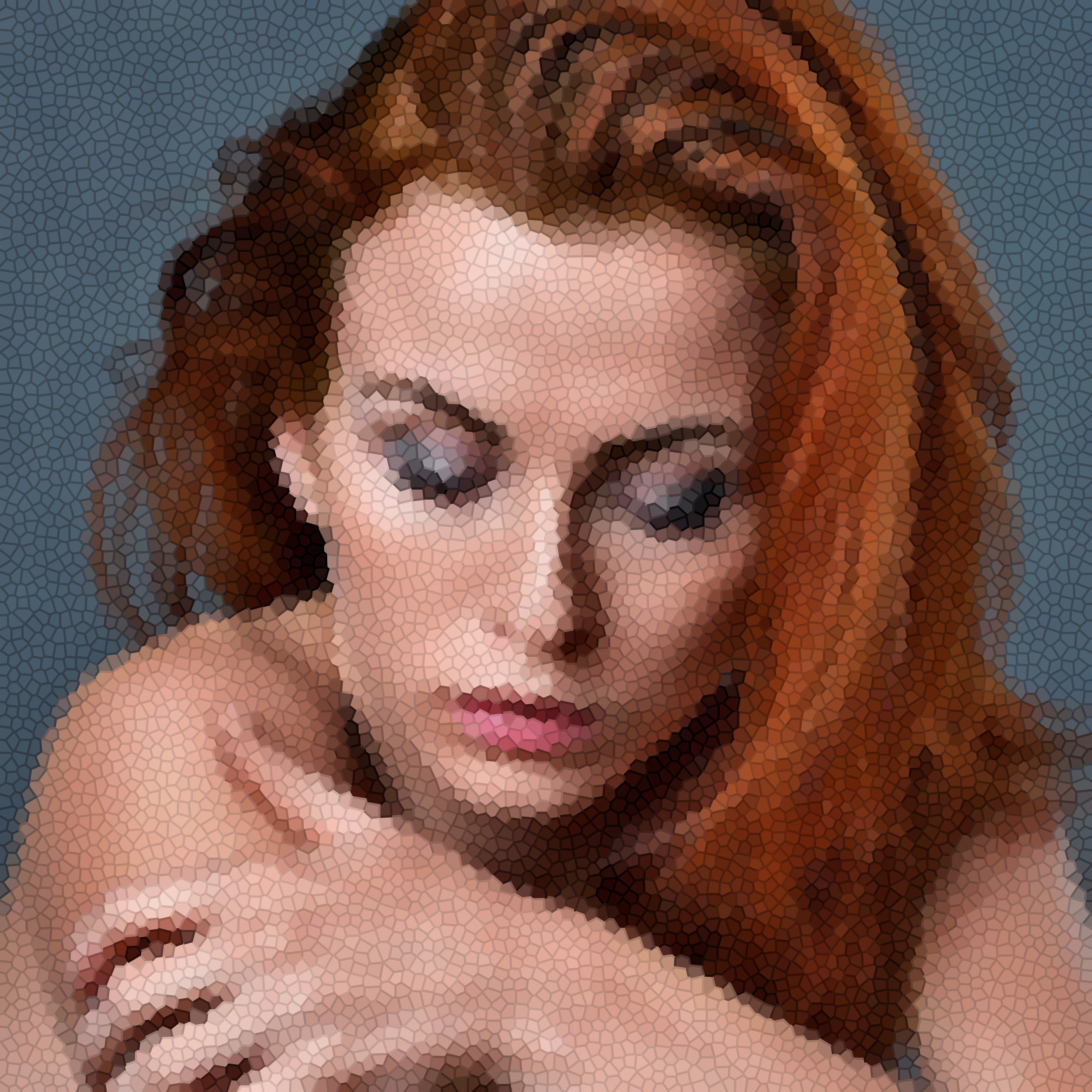
Here, I just generate a Voronoi diagram based on the generated points. The tiles are colored with the average color in the image at that location, and the borders are slightly darkened to give it a mosaic-like look.
Layered Voronoi Abstracts

Here, I just generate a Voronoi image as in the previous one. However, I color the polygons at a 50% opacity and layer them ten times. Since the generated Voronoi diagrams are slightly different each time, they form this nice abstract look.
Cross Hatching
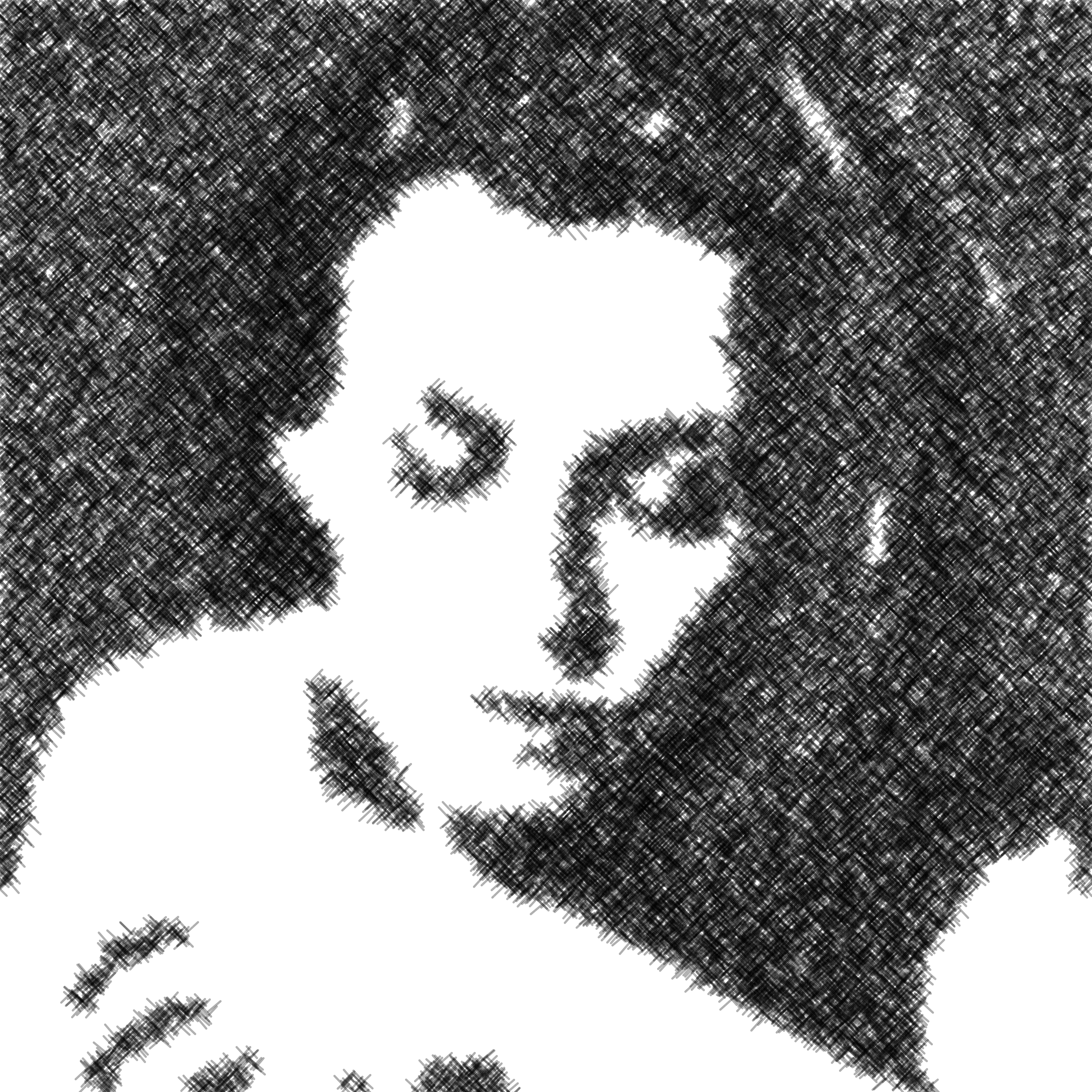
Here, I just ignore points whose grayness value is above some threshold (that is,
they’re too light), and for the remaining ones, I generate some cross-hatched lines
using some translate() and rotate() calls.
Pointillism
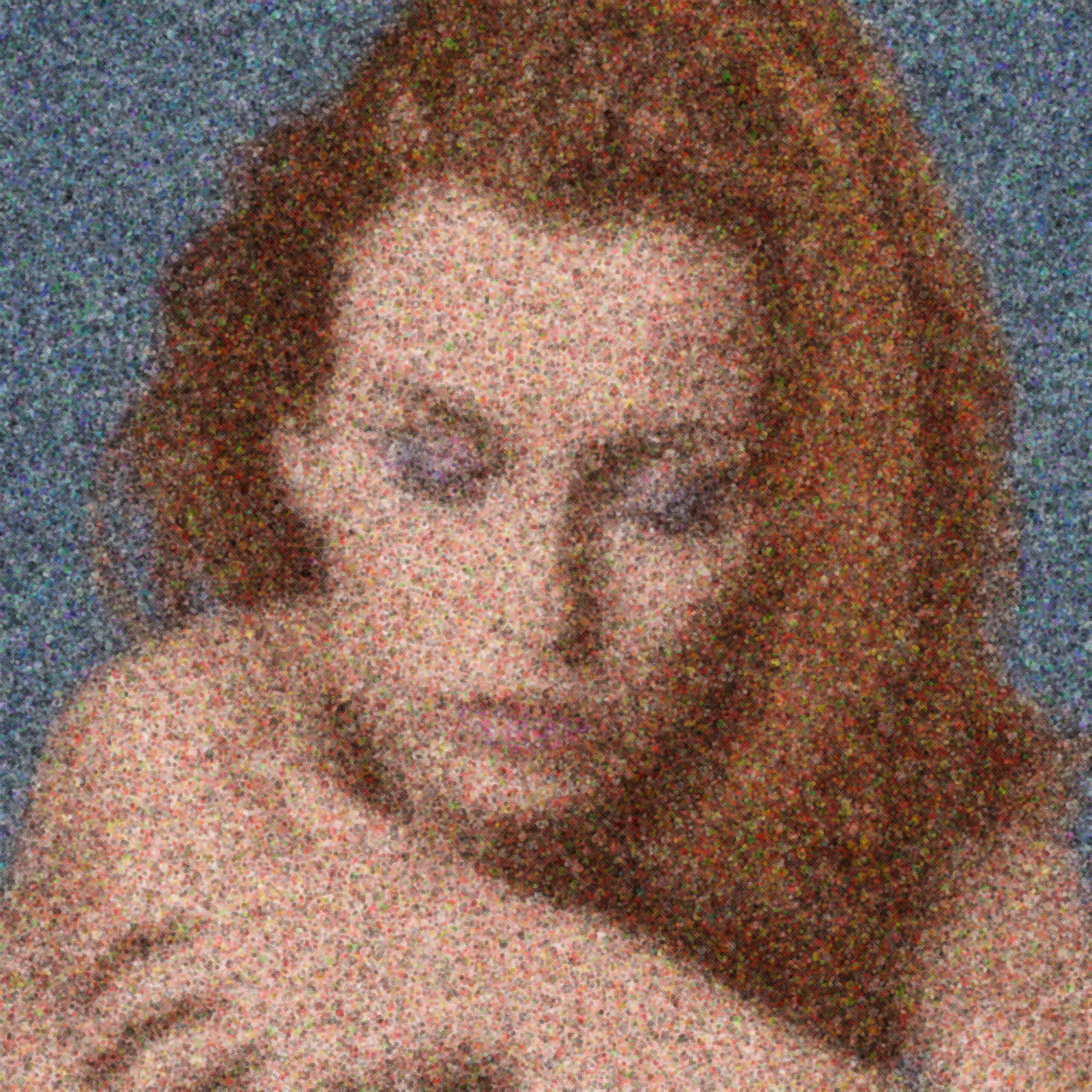
Here, I create a base layer that follows the colors of the image strictly, but only when using large radii. When I get to the smaller radii, I start increasing the color variance a lot, resulting in a nice Pointillistic image.
Post-Impressionistic

In this one, I successively reduce the radius for which points are generated. For each set of points at a given radius, I generated brushstrokes oriented based on the image gradient at that point. My gradient implementation was not particularly good, and resulted in interesting artefacts! A little variation in the color brings out the character even more!
These are barely scratching at the surface of what is possible! If you come up with some cool examples, do write to me and I’ll add them here!
In the meantime, you can subscribe to my list to stay informed on new posts! No spam, guaranteed.