Procedural Color - Creating Color Variations
In this post, we’ll look at some techniques for creating interesting color variations of a base color. This is immensely useful when trying to give a more organic, textured feel to generative art.
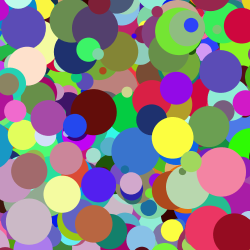
The solution that most of us have used at some point or other for generating color variations is to use random RGB values. Something like this:
color c = color(random(255), random(255), random(255));
The biggest problem with this approach is that it’s ugly. More specifically, random variations in the red, green, and blue channels leads to colors that have no cohesion between them. Nothing ties them together.
 |
 |
 |
 |
A better approach is to start with a base color and generate variations of it. Since these variations are derived from a single base color, they tend to work better together.
The post will primarily deal with HSB colors but for completeness, I’ll also present a few techniques that I’ve found that work with RGB colors.
Techniques Covered
Weighted RGB Mixing RGB Blending Varying Hue Varying Saturation Varying Brightness Two-Channel Variations
Weighted RGB Mixing
The first method we’re going to look at is a simple, incremental improvement over random RGB values, and involves adding an extra step of mixing in a base color with each randomly-generated color.
There are a couple of ways to perform the mixing in a controlled fashion. In this technique, to give more control of the mixing, we make use of a user-specified weight, which specifies the percentage contribution of the components of the mix color.
For example, a weight of 1 specifies that the 100% of the final RGB components should come from the mix color while a value of 0.5 specifies that we should use an equal proportion of the RGB components of both, the base color, and the color being mixed.
/*
 * Mix randomly-generated RGB colors with a specified
 * base color. The mixing is performed taking into
 * account a user-specified weight parameter 'w', which
 * specifies what percentage of the final color should
 * come from the base color.
 *
 * A value of 0 for the weight specifies that the 100%
 * of the final RGB components should come from the
 * randomly generated color while a value of 0.5
 * specifies an equal proportion from both the base color
 * and the randomly-generated one.
 */
color rgbMixRandom(color base, float w) {
  float r, g, b;

  /* Check bounds for weight parameter */
  w = w > 1 ? 1 : w;
  w = w < 0 ? 0 : w;

  /* Generate components for a random RGB color */
  r = random(256);
  g = random(256);
  b = random(256);

  /* Mix user-specified color using given weight */
  r = (1-w) * r + w * red(base);
  g = (1-w) * g + w * green(base);
  b = (1-w) * b + w * blue(base);

  return color(r, g, b);
}
The above code takes a base color and a weight as arguments and returns a new color that is mixed with a randomly-generated RGB color using the specified weight. Let’s now look at some ways we can use this.
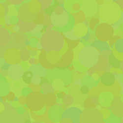
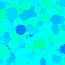
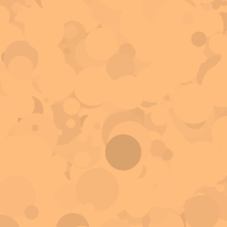
Creating Subtle Variations: since randomly-generated RGB colors are not very harmonious together, this approach works great when using higher weights for the base, giving us nearby variations of the base color (since it’s components are the primary contributors to the final, mixed color due to the large weight).
Here are some palettes generated using a random base color and a high weight of 0.9.
 |
 |
 |
 |
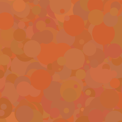
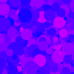
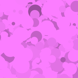
Strongly-Tinted Variations: The weight can be lowered to create more variation; it becomes more like adding a strong tint to randomly-generated RGB colors. Here is the same as above but with a lower weight of 0.6.
 |
 |
 |
 |
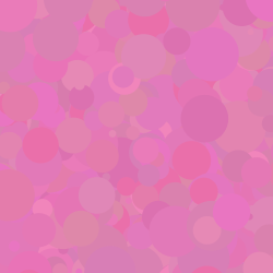
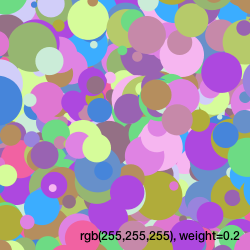
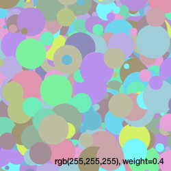
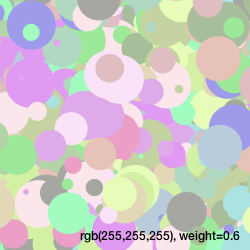
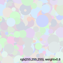
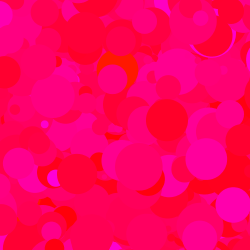
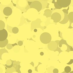
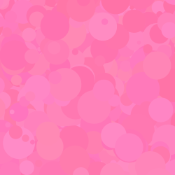
Generating Pastel Colors: another trick we can use is to generate pastel colors by specifying white as the base color and using a high weight. This mellows down the randomly-generated RGB colors, giving us soft pastel colors. Depending on the weight used, these tend to work well together. Here are some examples of using white as the base color while varying weights from 0.2 to 0.8 in intervals of 0.2.
 |
 |
 |
 |
Better RGB Blending
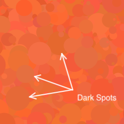
One problem with the weighted mixing approach above is that it doesn’t mix the way RGB colors actually mix and can results in unnatural transitions between colours, resulting in dark spots of different values (see below for an example).
An RGB color can be thought of as a set of three dimmers controlling three lights colored red, blue, and green that are pointed at a pixel. As an example, if the “red dimmer” is set to the highest value, it overpowers the green and blue ones, giving us a reddish pixel.
We can use this to improve our color-mixing: instead of weighting the red, green, and blue components themselves, we weight the squares of these components. The details are not particularly important, but basically you weight the squares because each component approximates the number of photons in a given area.
/*
 * Blend a given base (RGB) color with randomly-generated
 * RGB colors.
 *
 * A weight 'w' specifies how much of the final
 * blend should be comprised of the original base color.
 * A weight of 0 specifies that the resulting color should
 * be comprised entirely of the randomly-generated color,
 * while a weight of 1 returns the base color itself.
 */
color rgbBlendRandomWeighted(color base, float w) {
  float new_r, new_g, new_b;

  /* Generate components for a random RGB color */
  float r = random(256);
  float g = random(256);
  float b = random(256);

  float rb = red(base);
  float gb = green(base);
  float bb = blue(base);

  /* Check bounds for weight parameter */
  w = w > 1 ? 1 : w;
  w = w < 0 ? 0 : w;

  new_r = sqrt((1 - w) * pow(rb, 2) + w * pow(r, 2));
  new_g = sqrt((1 - w) * pow(gb, 2) + w * pow(g, 2));
  new_b = sqrt((1 - w) * pow(bb, 2) + w * pow(b, 2));

  return color(new_r, new_g, new_b);
}
Note that the only improvement we’ve made is that we use a sum of squares of the RGB components and take the square root of the result. The rest stays the same.
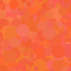
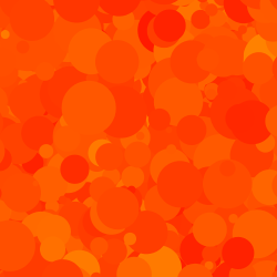
Here are the results. The two swatches below are identical, except that the swatch on the left is from our previous, weighted mixing algorithm, while the one on the right is from our new blended approach. Notice the dark patches in the weighted one that look better in the blended one (if you’re on a laptop, try observing the patches from different screen angles)!
 |
 |
The HSB (or HSV) Color Space
We now move into the HSB (also called HSV) color space. The advantage of using HSB colors is that it is easier to reason about. Changing the individual components of HSB colors changes them fairly predictably compared to RGB variations.
HSB colors comprise three components, a hue that determines the base color, a saturation component that determines how “pure” the color is, and brightness (or value in the HSV color space), which specifies how much light is falling on it. An easy analogy is that of actual paint: hue represents the raw pigment color that’s being used, saturation represents the concentration of the pigment in the paint, and brightness refers to the light under which we look at it.
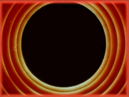
The image below shows how these three components are organized in the HSB colorspace.
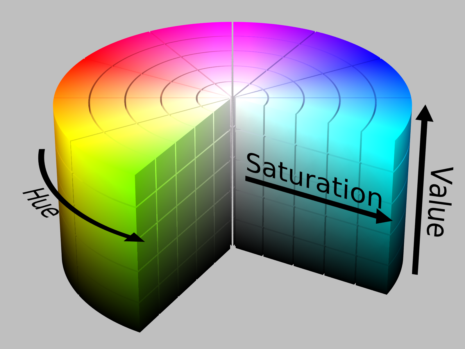 The HSV or HSB color space. (Source: Wikipedia)
We can use this to build much more controlled color variations, and the first approach we’re going to look at is varying the hue.
Note: To use HSB colors in Processing, one has to call the colorMode() function.
We’re going to assume the ranges for the hue, saturation, and brightness to be
360, 100, and 100, respectively. Using 360 for the hue allows us to use angles
to represent colors on a color wheel.
colorMode(HSB, 360, 100, 100);
We’re also going to first define a low-level function that lets us vary the attributes of an HSB color. We’ll continue using this for the rest of our experiments with HSB colors.
/*
 * Given an HSB color 'base', vary its hue, saturation, and
 * brightness values by the amounts 'hv', 'sv', and 'bv',
 * respectively.
 */
color hsbModify(color base, float hv, float sv, float bv) {
  /* The hue should be wrapped around if it crosses 360 */
  float new_hue = (hue(base) + hv) % 360;
  float new_sat = constrain(saturation(base) + sv, 0, 100);
  float new_bri = constrain(brightness(base) + bv, 0, 100);
  return color(new_hue, new_sat, new_bri);
}
Above, we constrain the saturation and brightness to the range 0 to 100. We treat the hue value as an angle on a color wheel, and wrap it back to zero if it goes past 360.
Varying Hue
Remember that the hue value is analogous to the pigment color in real paint. That means, variations in the hue results in changes in the color itself. Rather than try to explain how this works, let’s play around with hues!
We start by defining a function that varies the hue of a base color randomly.
color hsbVaryHue(color base, float variance) {
  return hsbModify(base, random(-variance, variance), 0, 0);
}
Above, we use the hsbModify() function to modify only the hue of the base
color, which is calculated as a random value specified by the variance parameter.
The saturation and brightness of the base are left as is.
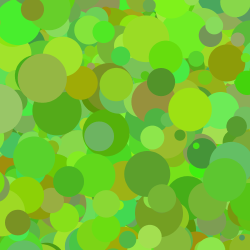
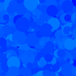
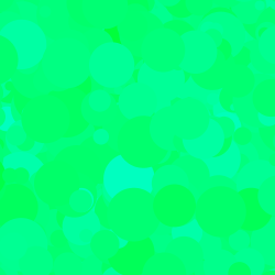
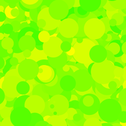
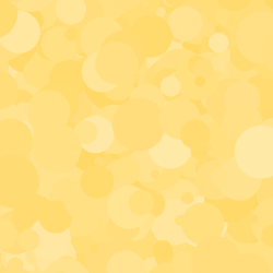
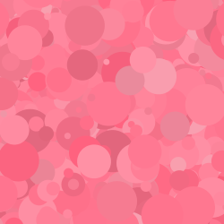
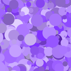
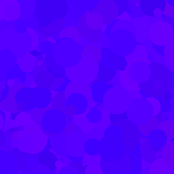
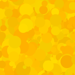
Subtle Textures: Here are some examples using a base color with a random hue, a brightness and saturation of 100%, and a small variation in hue of 5° This results in subtle changes in the color itself, which when applied to fill areas results in an organic texture.
 |
 |
 |
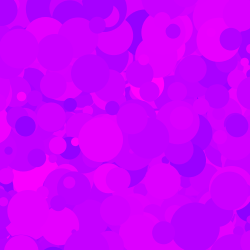 |
Below, the variance is increased to 10, (i.e., the hue is shifted randomly by up to 10° either clockwise or anti-clockwise). This gives a bit of perceptible variation in the colors.
 |
 |
 |
 |
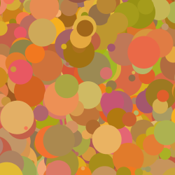
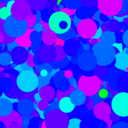
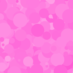
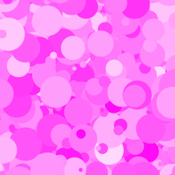
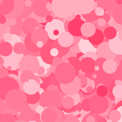
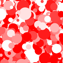
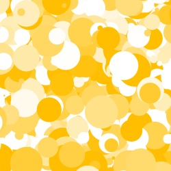
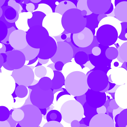
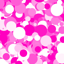
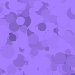
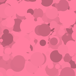
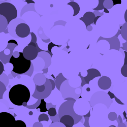
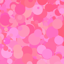
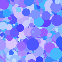
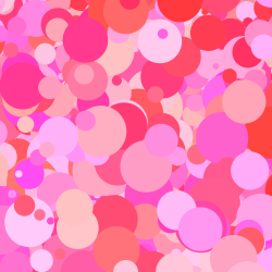
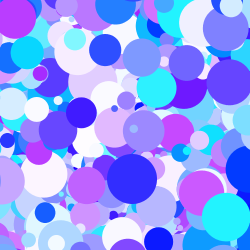
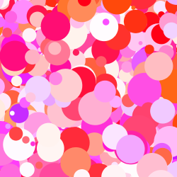
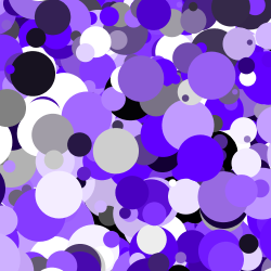
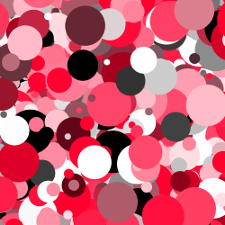
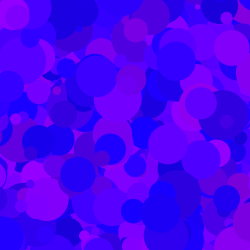
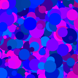
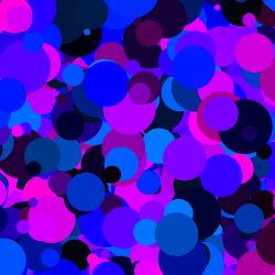
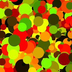
Analogous Colors: here are the results with a larger variance of 30°. Notice how we now start to see different colors but they still work somewhat well together. These “nearby” colors on the color wheel are known as analogous colors, and we’ll look into them in more detail later on in the article.
 |
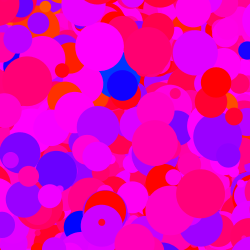 |
 |
 |
Varying Saturation
Continuing the paint analogy, real-world paint consists of pigments mixed in with a binder of some kind (e.g., linseed oil or gum arabic). As the level of pigment is increased relative to the amount of binder, we get a more saturated color. As it decreases, the strength of the color decreases. Saturation in HSB colors works a similar way. Let’s play around with saturation to see how this looks.
We again start by implementing a function similar to what we did for varying hues:
color hsbVarySaturation(color base, float variance) {
  return hsbModify(base, 0, random(-variance, variance), 0);
}
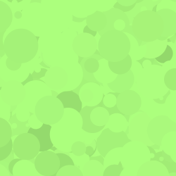
Below, we start with a randomly-generated base color with a saturation of 50% and a brightness of 100%. We then introduce a 5% variation in saturation. This kind of small variation is again very useful for creation very organic-looking textures.
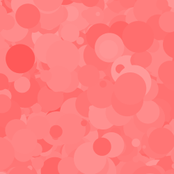 |
 |
 |
 |
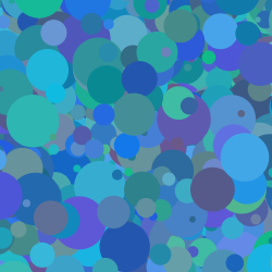
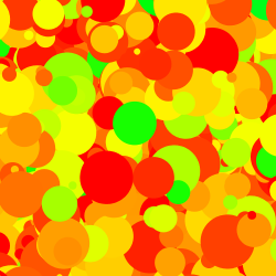
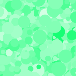
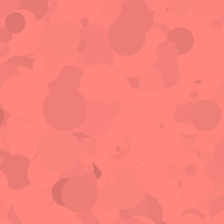
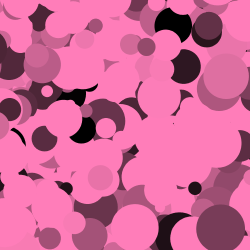
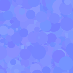
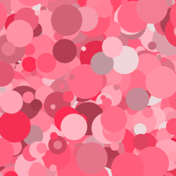
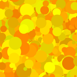
And here are some examples with a higher variation of 15%.
 |
 |
 |
 |
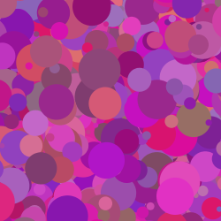
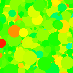
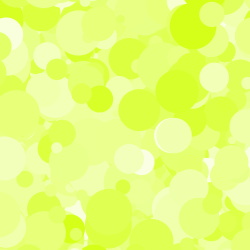
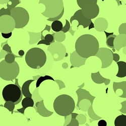
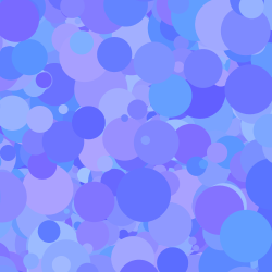
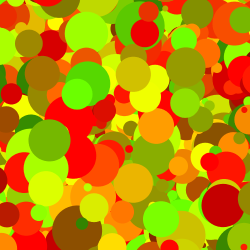
Here we use a high variance of 50%. With an initial saturation of 50% for our base color, we see saturation values anywhere between 0% and 100%. This strong contrast due to the introduction of strong whites and pure colors gives a very fresh feel.
 |
 |
 |
 |
Varying Brightness
We now get to the final lever that we have in the HSB color space: brightness (also called value when referring to it as HSV).
Think of looking at a painting under a desk lamp. Now dim that lamp and watch all the colors become more “grayish” until finally everything goes to black. This is what brightness refers to. Low values of brightness tend towards black and higher values of brightness bring out a brighter color. In fact, with a brightness of zero, no matter what values you use for hue and saturation, you will get black.
It’s a little non-intuitive but brightness does not refer to “lightness” or color value in the traditional sense. In HSB, this traditional notion of value requires changing both saturation and brightness.
Again, let’s try to understand how it works visually. Here’s the helper function we’re going to use:
color hsbVaryBrightness(color base, float variance) {
  return hsbModify(base, 0, 0, random(-variance, variance));
}
Below, we take a base color with 50% saturation and 100% brightness as above, and use a variance in brightness of 5%.
 |
 |
 |
 |
Again, similar to varying the saturation and hue at low variances, you can create smooth, subtle variations in color with this. However, note that in this case, you start to see darker spots! Next is an example with a 15% variation in brightness.
 |
 |
 |
 |
Finally, here is an example with a 100% variance in brightness. Since our base has a 100% brightness, this results in anywhere from 0% to 100% brightness of the final color.
 |
 |
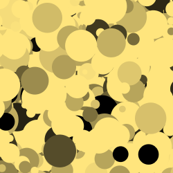 |
 |
You might be wondering why you would ever use such a large reduction in brightness. One useful trick is to create near-black colors when designing palettes based around a specific color. Using a low-brightness version of a given hue makes it fit into a monochrome palette better than using a pure black. We’ll look at this in more detail later in this article!
Two-Channel Variations (H+S, S+B, & H+B)
Now that we’ve looked at how varying the three HSB levers affects base colors, we can start to combine these variations two channels at a time.
Here are some helper functions to vary different pairs of HSB channels:
color hsbVaryHS(color base, float hv, float sv) {
  return hsbModify(base, random(-hv, hv), random(-sv, sv), 0);
}

color hsbVarySB(color base, float sv, float bv) {
  return hsbModify(base, 0, random(-sv, sv), random(-bv, bv));
}

color hsbVaryHB(color base, float hv, float bv) {
  return hsbModify(base, random(-hv, hv), 0, random(-bv, bv));
}
Varying Hue and Saturation
Here is an example showing what happens as you increase the variance in both hue and saturation:
 |
 |
 |
 |
 |
 |
 |
 |
As you can see, as the variation is increased, we start to see beautiful color combinations with nearby colors. Since we increase both variations equally, we also see an increase in contrast as the lightness jumps between whites and fully-saturated colors. As mentioned earlier, these “nearby” colors on the color wheel are called analogous colors and we’ll look at them in more detail later.
Varying Saturation and Brightness
Here is an example of increasing the variance in both saturation and brightness:
 |
 |
 |
 |
 |
 |
The varying saturation above gives a nice mix of colors, but as you can see the brightness variation is quite strong and results in pockets of near-black colors. In general, the brightness control of HSB colors is the strongest perceptually and should be used sparingly.
Varying Hue and Brightness
Finally, here is an example of increasing the variance in both hue and brightness:
 |
 |
 |
 |
 |
 |
 |
 |
As you can tell from some of these, there is a huge range of possibilities going from subtle variations to beautiful harmonies to gaudy blasts of contrast. In fact, the above examples were only limited to the two channels having an equal variance; you can control each channel independently as well. However, exploring these possibilities I leave to you.