Procedural Color - Value/Tonal Keys
In my last post on the monochromatic color scheme, I showed how we can use values to emphasize certain parts of our artwork. We can color specific shapes or elements in contrasting colors to highlight them, or merge them into the background with nearby values.
In this post, I want to step back a little from the values of low-level elements and briefly look at a similar idea that works at the bigger picture of the entire artwork: value or tonal keys.
A value key in your artwork is very similar to the notion of a key in music: from all the notes available to you, you pick out a specific subset that works well together. Similarly, a value key restricts the set of values from our previously-generated value scales in order to express something more deliberate.
In the traditional painting world, you primarily deal with three value keys: high, middle and low keys. These are illustrated below. Again, remember that these are not any hard rules but merely approximate guidelines; the number of values you choose to work with, and your own tastes will determine what these ranges are.
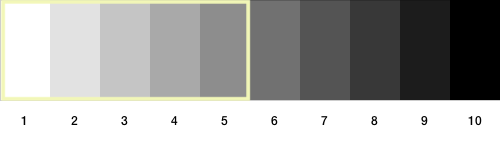 A high key. We restrict values to between approximately 1 and 5.
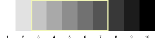 A middle key. We restrict values to between approximately 3 and 7.
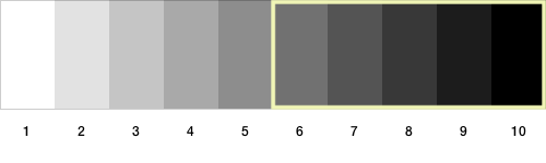 A low key. We restrict values to between approximately 6 and 10.
Note the terminology here: a high key does not mean we choose the higher values on our value scale. It implies lighter values. Darker values imply a low key.
Why Should I Care?
In traditional painting, where an artist paints a particular scene, the value key is pre-determined to a large extent. For example, a plein air on a gloomy day is going to be low key, with darker values across the landscape. A bright sunny day will likely be a high key. However, as generative artists, we get to design color from the ground up. We can be more deliberate in our choices and express our intentions more clearly through the use of value keys.
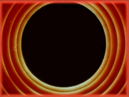
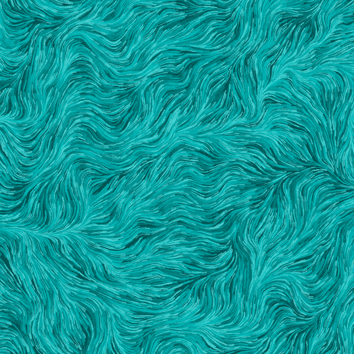
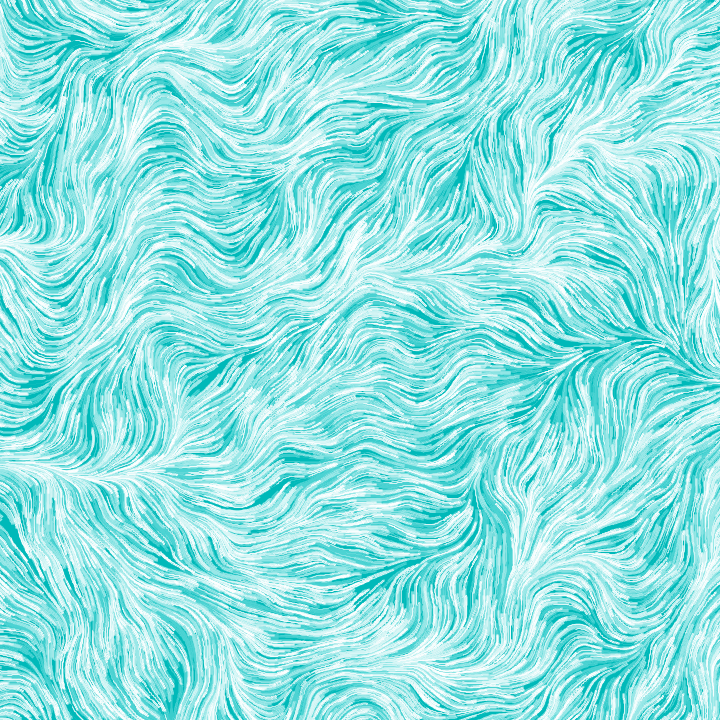
Here is an example of a simple artwork based on Perlin noise fields:
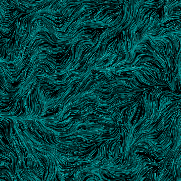
Above, I use a ten-value scale for a blue-ish hue and use all ten values to color particles flowing through a perlin-noise based vector field.
Now let’s look at how we can use value keys to be more deliberate in our choice of values. Here is a version of the above image with a low key, using only the darker values:
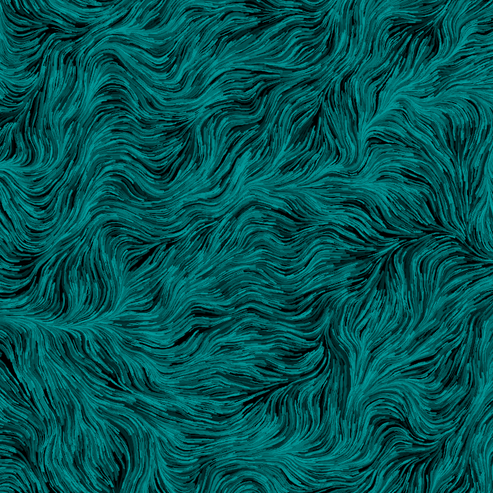
Here is the same image as above, but using a middle key:
Finally, here is an identical version using a high key, with only the lighter values from our value scale:
Now why would you want to do this? First, there’s the aspect of the clear visual difference between each one. You might want a specific overall shade for your artwork, which naturally leads you to a subset of values.
However, this is not the primary reason I’m writing about this. The big reason I think value keys can be powerful for generative artists is because it provides more control over your artwork, opening it up for other elements. Further, by reducing the value contrast, we remove the strength of value alone to define the entire artwork, giving us breathing room to add in different kinds of contrasts (e.g., hue, shape, and temperature).
For example, recall from my previous post that we can use contrasting values to direct the viewer’s eye towards certain elements on the screen. Here are three very simple examples of this. Notice how your eye jumps immediately to the few contrasting streaks in each of these images:
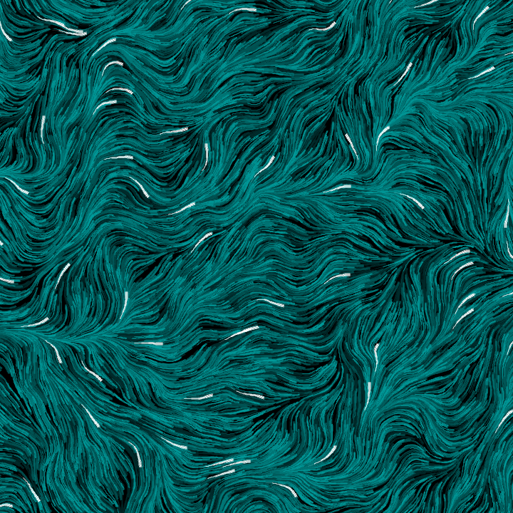
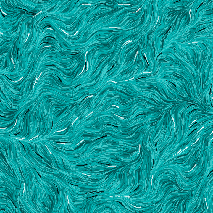
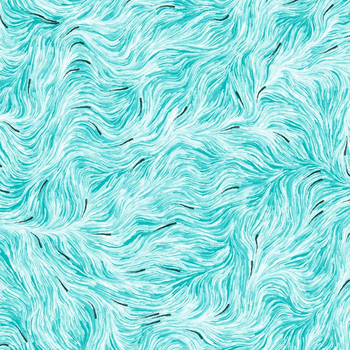
Notice how your eye is directed towards the white streaks in the image with a low-key background. Simiarly, we end up highlighting both the white and black streaks with the middle key background, and the black with the high-key background.
Here is a similar example but using the full range of values from our value scale:
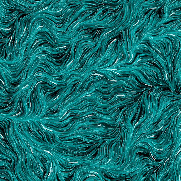
It’s subtle, but the larger range of values in the background lowers the contrast for the white streaks, making things a bit more muddy. Or perhaps that’s exactly what you want! Maybe you want the whites to be subdued through the use of a full value range. However, thinking about value keys lets you be more deliberate in this choice, rather than hoping for the best. After all, a piece of visual art is merely an exercise in configuring values across a canvas in interesting shapes with some color thrown in!
That’s all for now! Enjoy!