Procedural Color - Monochrome Color Schemes
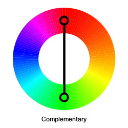
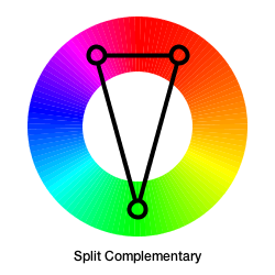
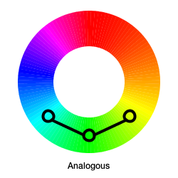
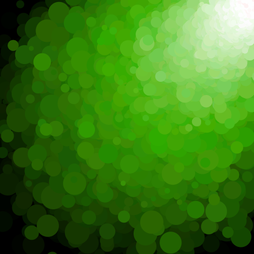
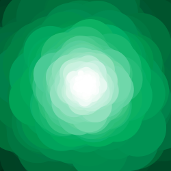
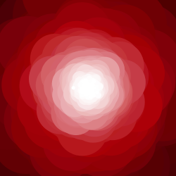
Now that we have our RYB color wheel set up, we’re going to start exploring some of the more common color harmonies: monochromatic, analogous, complementary, split-complementary, warm-cool, triadic, and tetradic. As a preview, here are what these harmonies look like:

 |
 |
 |
 |
 |
 |
Note: when talking about color harmonies, it’s important to note that we’re talking just about hues that work well together. Saturation and brightness can be independently varied while still maintaining a sense of harmony.
Monochromatic Color Schemes
Monochromatic colors are those where just a single hue is used and only saturation and brightness are varied. In fact we’ve already encountered monochromatic colors when looking at S+B variation in a previous article. Basically, if you think of the HSB color space as a cylinder, we’re looking at the different colors on a single sliced side (as highlighted by the black rectangle below).
Since they use just a single hue, monochromatic colors are guaranteed to be harmonious. In fact, they have the highest degree of harmony possible. The flip side is that they have a very low degree of hue contrast: they tend to be reserved and don’t pop out at you.
Value Scales
Rather than randomly varying saturation and brightness, a more structured approach to monochromatic color schemes involves building value scales. To do this, let’s first understand the concept of value itself.
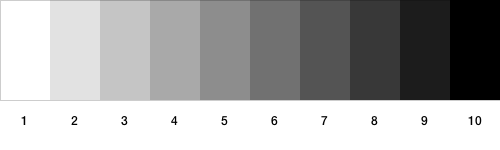
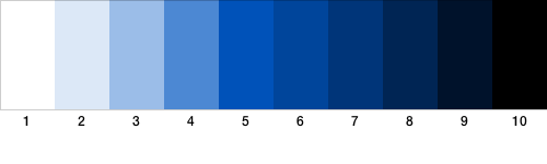
Value refers to the lightness or darkness of a particular color. White is considered the lightest value, while black is the darkest. Typically, artists use a discrete number of steps going from white to black, and this is called a value scale. Below is an example of a gray-value scale with ten steps:
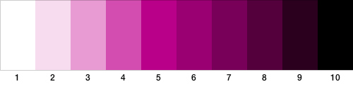
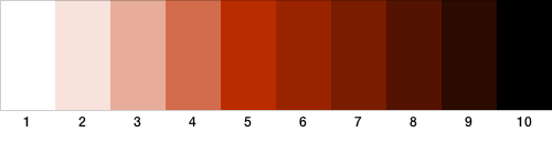
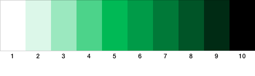
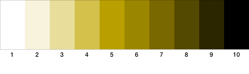
Now what’s important to note is that value is independent of the color itself. In fact, each color (or hue) can have the full range of values as well. Here are some examples of value scales for some colors:
Generating Value Scales
To procedurally generate color value scales, we need to first understand the relationship between hue, saturation, and brightness in the HSB model.
A simplistic, but effective, way to think of how these relate in HSB is to think of lowering saturation as adding white to a pure hue, and lowering brightness as adding black to it.
Unfortunately, this also means that the brightness component of HSB (or “value” when referring to it as HSV), is not the same “value” that we’re after. Our idea of value requires taking a color from white all the way to black with a pure hue somewhere in between. Therefore, to programmatically generate value scales, what we need is a variation in both the saturation and brightness channels in HSB.
There are many complex ways to get perceptually equidistant values using complex color models like HSL or LCH. However, I found the following little function to do the trick well enough for what I wanted!
color[] hsbValueScale(float hue, int n) {
  color[] scale = new color[n];
  for (int i = 0; i < n; i++) {
    float saturation = 100;
    /* Vary the brightness regardless of value number */
    float brightness = map3(i, 0, n - 1, 100, 0, 1.6, EASE_IN);
    /* Increase saturation only in the first half */
    if (i < n/2)
      saturation = map3(i, 0, n/2 - 1, 0, 100, 1.6, EASE_IN);
    scale[i] = color(hue, saturation, brightness);
  }
  return scale;
}
The basic idea is to increase the saturation from 0% to 100% and lower the brightness till we’ve reached halfway across the scale. Then following that, saturation is kept fixed at 100% and brightness is continually lowered till it hits zero.
I tried a linear mapping using Processing’s map() function but found it to not
give a clear perceptual difference between the steps. Instead I just brute-forced
different combinations of easing functions till
I found a good fit (the map3() calls above).
Gray-value scales: one exception is when it comes to generating gray-value scales. In this case, just linearly varying the brightness while keeping saturation at zero is sufficient. (The hue component is ignored entirely since saturation is zero). For this, I have a second version of this function that takes no hue as a parameter and generates a grayscale version:
color[] hsbValueScale(int n) {
  color[] scale = new color[n];
  for (int i = 0; i < n; i++) {
    float saturation = 0;
    float brightness = map(i, 0, n - 1, 100, 0);
    scale[i] = color(0, saturation, brightness);
  }
  return scale;
}
And that’s it! You can now play around with different value scales and explore monochromatic palettes in a more structured way!
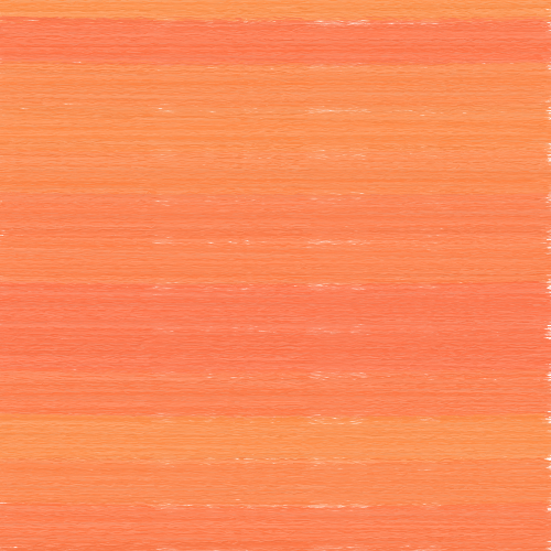
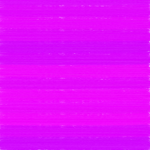
Now that we’ve looked at how to create value scales programmatically, here are some very simple examples of the kinds of effects you can get out of these value scales:
 |
 |
 |
 |
 |
 |
 |
 |
 |
 |
 |
 |
Why Do Values Matter?
There are two big reasons why values matter. First, changes in value are what confer an illusion of depth to a painting, and second contrasting values can be used to create a strong focal point within an artwork.
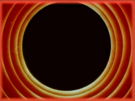
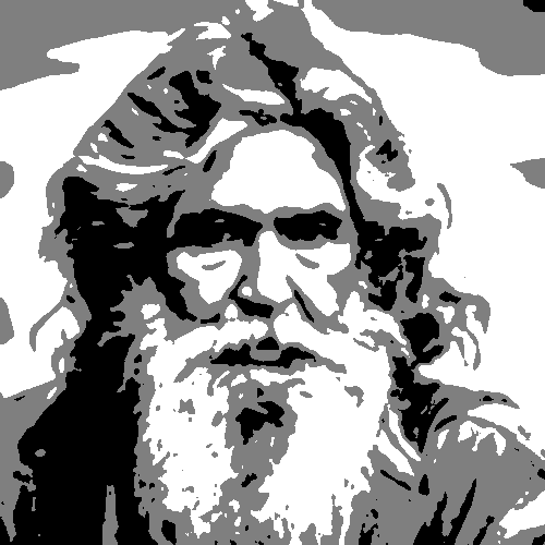
Gradations of value create the illusion of depth. It’s what we see when we look at a grayscale version of an image. Here’s an example of a generative portrait I made a while back using k-means clustering. It consists of just three values: white, black, and a middle gray. Even with just these three values it gives the image a sense of depth. A three-dimensional feel.
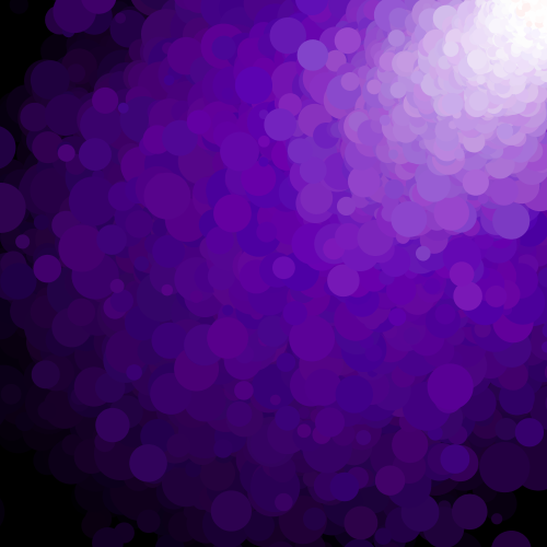
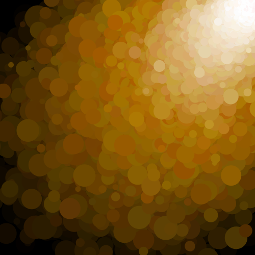
Here’s another example showing that value is the most important aspect of color when it comes to giving a sense of depth. Below, I’ve generated versions of a simple still life using value scales. For each pixel in the image, I replace it with a random hue, but pick values from a value scale based on the grayscale level. As you can see, regardless of the hue used, the sense of depth remains; this is because the values are consistent with the original!
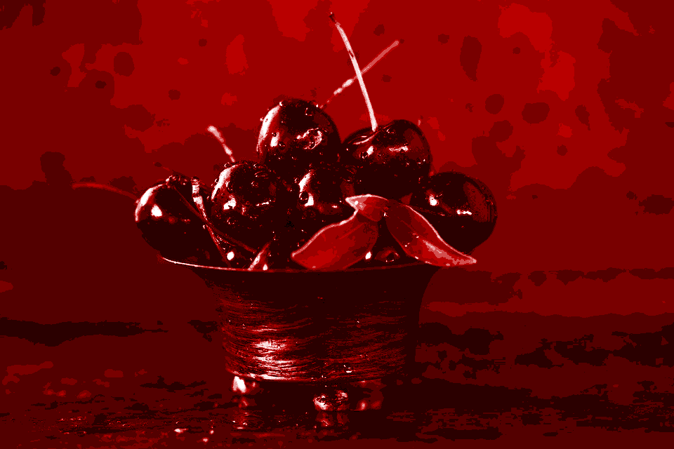 CC0-licensed image courtesy of Pexels
Value contrast creates focal points. Placing elements with strongly-contrasting values next to each other tends to immediately draw the eye to those points in an artwork.
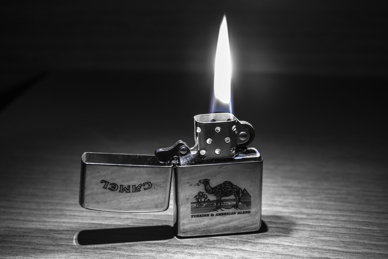
Looking at the above image, regardless of where you start out, you’ll find your eyes sort of sinking down to the bright flame area, which has a strong value contrast with the dark background, and the rest of the image in general. Only from there do your eyes wander to the other details of the scene.
This difference in contrast doesn’t even have to be so strong. Here is another example of this:

Above, the focus immediately jumps to the eyes, which stand apart from the somewhat lighter area around her upper cheek even though the contrast is not as high in the previous image. Also note how the darkened eyelashes make the eyes stand out even more by introducing a strong value contrast! The next thing that stands out is the earring, which has a lighter value compared to the rest of the scene.
Finally, we can see a similar focusing of the viewer in color images as well:

Did your eyes jump immediately to the bright sign on the building right of center? Possibly to the building by the water? That’s because the contrasting values are like a magnet for your eyes!
None of this is magic; it’s simply how our eyes work, and as an artist, introducing value contrast is one tool in many that allows you to guide the viewer through your painting.
Enjoy!