Easing Functions in Processing
TLDR: I implemented a more flexible map() function for Processing incorporating various common easing functions. You can find all the source code over here on Github.
In my last post I had made the following image using Cohen-Sutherland line clipping.
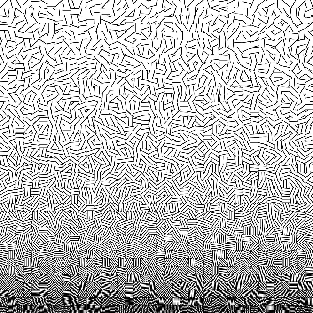
To create the above image, I had picked a random angle for the lines in each square and varied the spacing between lines based on the Y-axis location of the square.
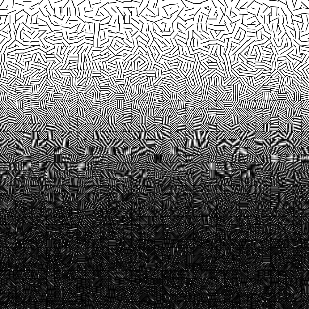
Something about the above image bothered me: I wanted more darkness in the
lower half. Unfortunately, Processing’s map() function that I use only does
linear interpolation in the range that it is provided (as far as I know).
So I went ahead and implemented some more options! Here is the same image using
my custom map() replacement (called map2() of course) with a quartic
ease-out to calculate the spacing between
the parallel lines in each grid square, in place of the standard linear mapping. If that doesn’t make any
sense yet, keep reading!
Processing’s map() Function
Let’s first try to understand how the Processing map() function works. The
map() function translates an input range into an output range linearly.
A simply way to visualize this is to look at a 2D space as shown below, where I’ve used a value between 0 and 100 on the X axis, and map it to a color between white and black on the Y axis.
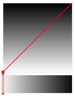 A visual representation of Processing’s linear
 map() function.
The map() function essentially allows one to “traverse” this space in a
straight line.
The effect of this is shown in the color slider above, where each shade of
gray is represented equally. That is, gray values are uniformly distributed.
Unfortunately, that means that simply sticking with the default map()
implementation limits our options. What if we want darker tones
to be represented more with only a quick transition at the end to lighter ones?
Luckily, a straight line through the 2D space shown above is not the only route we can take! In fact, we can take an arbitrary walk through this space to get to our destination. Enter easing functions.
Easing Functions
The idea behind easing functions is to use a more complex curve rather than a straight line, to traverse the 2D region mapping our input range (on the X axis) to our output range (on the Y axis).
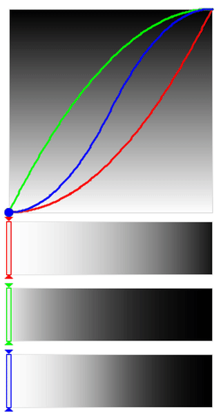
Here is an example of a quartic curve, where the Y-axis values are a function of $x^4$. (This is in contrast to a line which is simply a function of $x$.)
 A visual representation of a sinusoidal easing function.
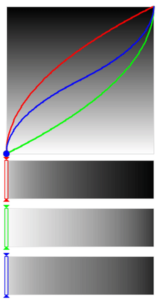
Understanding the Visualization
Let’s try to understand what is going on in the above animation a bit more.
First, the animation shows three curves, which correspond to different types of easings or transitions. The red curve shows easing in, where it starts out slowly and then speeds up to the final speed. You can see this if you look at the Y position of the red dot as the slider below moves at a fixed speed. It stays for a while in the lower part and only later jumps up to the upper area.
The green curve shows easing out, which is the opposite of easing in. The green dot moves through the output range (the Y position) very quickly in the beginning but slows down once it reaches the upper regions.
Finally, the blue curve shows a combined easing in and out. In this case, the initial and final parts of the range are traversed slowly, with only the middle region being fast.
Easing Functions & Color Distribution
In the animation above, the three bars at the bottom capture the Y value of the curve (in the form of a gray value) as a function of the X value (the position of the slider).
What we see is that easing in stays primarily in the lighter regions.
In contrast, easing out stays primarily in the darker regions.
Finally, combined easing in and out results in a lot of light and dark with very little mid-tone.
This way, we can play with the curves and easings to achieve the right distribution of the output range (in this case, gray values) that we want.
A Better map() Replacement
I’ve gone ahead and implemented a set of easing functions (see Robert Penner’s easing equations here)
in Processing within a new map2() function. The function takes two
more arguments compared to the standard Processing map() function.
The first is the easing type and is one of LINEAR, SINUSOIDAL, QUADRATIC, CUBIC, QUARTIC,
QUINTIC, EXPONENTIAL, CIRCULAR, and SQRT.
The second is a parameter specifying where to apply the easing, and is one of
EASE_IN, EASE_OUT, and EASE_IN_OUT.
/* Old map() function */
map(value, 0, 100, 0, 255);

/* New map2() function */
map2(value, 0, 100, 0, 255, QUADRATIC, EASE_IN_OUT);
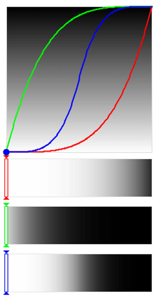
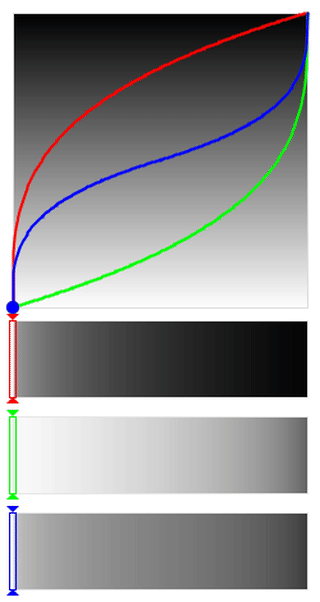
SINUSOIDAL to EXPONENTIAL Easing
From the easing functions mentioned above, the curves become steeper and steeper
as we go through the sequence SINUSOIDAL –> QUADRATIC –> CUBIC –> QUARTIC –>
QUINTIC –> EXPONENTIAL. The animations for the first and last one are
shown below for comparison.
 |
 |
You can clearly see that under the EXPONENTIAL
easing (right side) the dots spend more time in the extremes and move very quickly through
the middle areas, while it is more gentle in the case of the SINUSOIDAL easing (left side).
What this means for our visualization is that the colors that you will primarily
see in the case of our exponential easing are either very light or very dark
(depending on where you apply the easing), with a relatively sharp transition
and very few mid-tones.
The sinusoidal easing on the other hand is more gentle in its transitions.
This is particularly evident when looking at the middle
region of the blue EASE_IN_OUT bar.
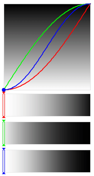
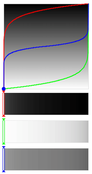
LINEAR and CIRCULAR Easing
The LINEAR easing function is equivalent to the standard map() function
provided by Processing, while CIRCULAR easing is relatively gentle when
only easing in or out, but very sharp in the middle region when combining
easing in and out.
|
 |
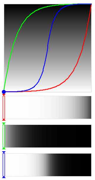
SQRT and Polynomial Easing
So far, we’ve seen that as we go from SINUSOIDAL to EXPONENTIAL, the focus
is removed more and more from the middle regions and pushed towards the extremes.
What if we want to do the opposite? That is, emphasize the mid-tones and de-emphasize
the extreme lights and darks?
This is where the SQRT easing function comes in. Below is the SQRT animation
(left) compared with a QUADRATIC animation (right). You can see that it’s
basically flipped, and the dots stay for a longer time in the middle region
in the case of SQRT. The resulting bars show the contrast between the two.
 |
 |
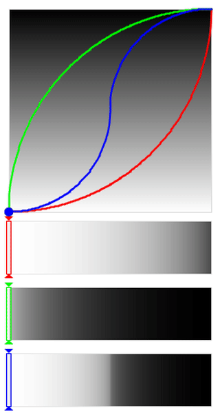
Finally, we can generalize this to a mapping where you specify what power the
X variable is raised to. This allows us to have even stronger focus on the
mid-tones using an exponent less that one. I’ve implemented a map3() function
that allows this. Here are two examples with an exponent of 0.3 (left) and 0.1 (right).
 |
 |
Notice how the focus in the bars has changed almost entirely towards the mid-ranges and de-emphasize the extremes.
Concluding Thoughts
Easing functions provide a lot of control over the distribution of values of
your output range. I started with my example of using it to create more darks
for the image below: I used a quartic ease-out to map the spacing between
the parallel lines in each grid square instead of the
standard linear map() function. All of that should make sense to you now!
If you’re interested in learning more, you should check out the following video recommended to me by Benjamin Kovach:
You can find all the source code for the easing functions in Processing over here on Github